Published on: 27.02.2023
Author: Alex Lavrynets
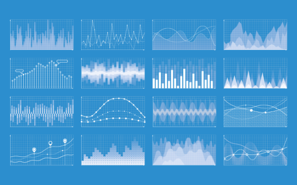
Data visualisation is an essential part of any data science process. It helps to facilitate understanding of data in their entirety and makes the process of data analysis more intuitive for professionals, researchers and the general public.
Data visualisation is the process of representing data in graphical form (e.g., generating a curve from the numbers in a table). When it comes to analysing complex data in massive quantities, visualisation is a key communication tool. The Swiss Academies of Arts and Sciences emphasise the importance of a dialogue between science and the public in the context of scientific communication, for which public demand has increased in recent years. Data visualisation continues to play an important role in communication in the context of the coronavirus. A dashboard provided by the Federal Office of Public Health (FOPH) keeps the public informed of the epidemiological situation, based on official data in Switzerland.
The DSCC team uses data visualisation in all data science projects on a daily basis. The steps of the iterative process in data science that can benefit from data visualisation are outlined below.
The problem formulation step
Data visualisation can help to identify specific user needs. Using a simple or interactive visualisation (e.g., a dashboard), a user could identify trends and relationships hidden in the data. This approach thus raises a question that requires further analysis. Visualisation can also help to identify the limitations of available data. It is therefore possible to collect new data to fill in these gaps.
The data collection step
Data visualisation can help the scientific team to collect data in a targeted way (e.g., using maps showing spatial distribution). In the case of poor-quality data (incomplete or missing), additional data collection or supplementation with other types of data could be considered. It is also possible to facilitate the collection of data by, for example, enabling users to enter values directly into an interactive dashboard.
The data preparation and analysis step
Data visualisation helps the scientific team to quickly identify missing values or outliers in the data. Subsequently, during the exploratory data analysis, the visualisation also helps to identify important variables and their relationship within a database. Visualisations that are commonly used in this context include bar charts, histograms and scattergrams.
The data evaluation and interpretation step
The data generated in the previous step is used to train algorithms (modelling). The data visualisation allows the evolution of established models to be followed and their performance compared. The most common visualisations here include regression curves, spatial distributions of a predicted value and trend prediction curves.
The provision of findings step
A graphic component can considerably enhance the communication of findings. Visualisations can help to make the results easier to understand for non-experts. These graphics can then be displayed in presentations and reports. Visualisations that are commonly used in this context include bar charts, pie charts and maps.
The ever-increasing amount of data and their complex relationships present a real challenge in their visualisation. The quality and accuracy of data remain key components in every graphical representation. To bridge the gap between data scientists and all stakeholders, the Unlocking the Power of Data Initiative was launched by the Confederation and its partners. This initiative strives to "advance data ecosystems and provide the information needed for a fact-based worldview".
Last update 27.02.2023